The symbol: the history and significance of a representation, from art to branding

Symbol: from Lat. symbŏlus and symbŏlum, Greek.’σύμβολον “combination”, “distinguishing sign “, “symbol”, derivative of of συμβάλλω “put together, make coincide” (comp. of σύν “together” and βάλλω «cast») [1]
In order to understand the present, it has become increasingly necessary to look into the past, not for rhetoric purposes, but to encourage evolutionary and speculative thinking. Carelessness, haste, and an ego-centric self-confidence have combined to produce a society that is unappreciative of knowledge and history. This is increasingly clear from our language, starting from our preference for words and phrases whose meaning and origin are not really known to us and whose signifier we, consequently, change, thereby voiding it of sense and destroying its meaning.
As is always the case, though, Art offers answers to everyday issues, by asking questions, opening up conversations, and revealing new angles for discussion. As we work with intellectual property, at Studio Jaumann Srl we focus our research on the importance of how ideas are represented, how they are translated from concept into reality, that shift entails a mutation and, as a rule, some form of representation. It is useful, then, to start by looking back, to find out as much as possible from what Art has revealed about the context of the symbol, i.e. what, in intellectual property, we frequently refer to as logos and trademarks, and also brand identity.
A symbol is simply a sign, graphic in nature, pertaining to a primary code, which concisely expresses a concept. A unique, instantly recognisable emblem, which is immediately understandable in terms of meaning, what it is intended to describe, tell, recommend, or make known. Over the centuries, from prehistoric times onwards, symbols have been used, as part of a non-verbal language, to reach ever broader audiences and, in their most refined forms, to even reach and be understood by those who speak a different language.
The symbol therefore becomes an icon.
Icon: from the Russian ikona, and from the Byzantine Greek εἰκόνα, Ancient Greek εἰκών -όνος «image»
[…] In semiotics, according to the terminology of C. S. Peirce (1839-1914), the icon is one of the three basic types of signs (the other two are the index and the symbol), which are all distinguished according to the relationship they have with the external world: a symbol is similar to an icon, in that it features at least one of the qualities or has the same configuration as the object it stands for.
[…] In IT, within operating systems with a graphical user interface, an icon is a small image that symbolically stands for a command, a function, or even a document or an operating program, which appears on a computer screen (often in the form of a button) and which, when selected by the user using a suitable tool (such as a mouse or an optical pen), starts the function or program it symbolizes (e.g. the rubbish bin icon is used to delete a file). click on the program icon; drag the icon from one folder to another.
[…] A figure or character who is representative of an era, a genre, or a milieu. [2]
When one thinks of an icon, the first thing that springs to mind is the images of sacred origin, the Orthodox Byzantine icons, Christian symbols such as the Cross, the Sacred Hearts, and the entire hagiography pertaining to every religious, mystical, or popular creed. As an Imago mentis, an image of the mind, an icon has an incomparable capacity to encompass a multitude of constituents of a thought and, at the same time, spread them extensively. Art, first in its sacred form and then as a secular medium, has made the icon – and likewise the symbol, the emblem, the allegory, and the metaphor – a means of showing a hidden message about reality – whether conscious or unconscious – which only the artist’s eye was and is able to perceive and reveal.
Painters, sculptors, and likewise photographers and directors, have drawn on the extensive repertoire of symbols from the past to produce depictions and languages whose meanings have often been lost. The work of art has thus assumed the role of carrier of codes which, while an integral part of a secular structure of thought, have often been lost over time.
It was medieval thought that was the first to reorganise the great universe of symbols originating in antiquity within a new theological concept, but creating a clear division between ‘symbols of good’ and ‘symbols of evil’. The Renaissance largely draws on classical culture, popularising it thanks to the invention of printing. Sets of symbols reach Europe from the Mesopotamian, Indo-Iranian, and Egyptian civilisations, accompanying the Greco-Roman symbolic images and those deriving from the Jewish Kabbalah. In addition to these elements are those pertaining to the alchemical and cosmological codes. This complex synopsis underwent regulation in the seventeenth century through in-depth study, though an intellectual activity that would then mutate again in the eighteenth, nineteenth, and twentieth centuries, reaching the new millennium as an immense compendium, which had been, in some way, organised into a classification capable of defining the value and meaning of each sign. However, symbols have been successfully simplified, philosophically, into mere icons used for information purposes, without, however, losing their prior importance.
Analysing the value of the symbol from other perspectives, one cannot overlook the aesthetic experience to which it belongs. The symbol, in fact, takes on the role of an oracle, to be observed, to be memorised, to be appropriated through an image, a ‘depiction’ of a response that is strong enough to become both the subject and the object of collective, universal memory and knowledge. A sort of interconnection capable of revealing utopian worlds that are at the same time real, amplifying their meaning, as well as their unique and peculiar rendering.
The symbol is part of the whole, the whole is part of us, and we are part of the whole.
In this way, the icon has the task of translating the underlying concept, the inspirational model, from which it stems and which it is intended to convey. This a key aspect in art, which was developed, during Humanism, in the desire to seek and generate an unusual harmony. One example is Leonardo da Vinci’s Vitruvian Man, the ultimate symbol of the cultural current of the time, which today is cloaked in a sacred aura that protects the very concept of emblem, rendering it untouchable within the universe of art and culture in general.
For centuries, works of art have taught us, however, how pivotal a role the symbol plays. It is an integral part of a work, offering the key to its interpretation. Very often, in reality, the work becomes a mere vehicle for the transmission of the symbol. A sort of short circuit which, however, is indispensable.
Art, understood as a code used to express of one’s existence, has chosen the symbol as an ‘exemplary’ value, a perfect form, ideal to serve a purpose. The symbol, as a means of evocation, an element of imagery, to be codified and decoded, depending on the moment, and a means of recounting, of managing that which has been defined as ‘the sacred of everyday life’. It is the entity of things, physical and otherwise, which is so great that it must be simplified, symbolised, to both become memento mori and be memento vitae.
Bearing in mind this and the indestructible relationship between Art and Symbol, one must endeavour to understand, meanwhile, how variable their relationship is in time and space, in the construction of a bond that can be reconstructed for each epoch and found in the virtually endless similarities of use and meaning between different cultures.
In reality, in our time, this has undergone a further evolution, entering the dimension of another aspect of everyday life, namely brand identity. As mentioned elsewhere, brand identity consists, broadly speaking, of the use of a brand, a logo, or a symbol. An emblem designed to express, through a sign, the identity of a business entity (commercial, industrial, and suchlike). To do this, these worlds rely on the experience of art, on its millennial ability to reach everyone, through a mark made within a space which has the power to remain firm within time and memory. Obviously, however, the symbol must have character and the energy needed to express the meaning in the right way.
A logo, therefore, is a multifaceted element and a space-time limbo which extends, supports, or facilitates a gradual conceptual immersion, through which one is exposed to an unknown element which must be made known and taken in. The symbol, in a certain sense, functions like an envelope, as part of a philosophical process that leaves a permanent trace, which is infinitely replicable and has the same power as its own message.
The logo, the brand, and therefore the symbol are entities which reflect and refract.
A first-hand account will undoubtedly allow better understanding of this idea. Take the story of the Studio Jaumann logo, for example.
Let’s analyse it together. What is the first thing that stands out? Three conceptual elements in relation, i.e. a symbol, a word, and a narrative, shown in that order. Let’s look at the logo, i.e. the symbol. It contains various allegorical elements, linked to concepts which are essential for the firm, namely an eye, a handshake, and two mirrored J’s. This mixture forms a synthesis featuring advanced graphics, that plants, through a few carefully placed strokes, a plurality of seeds of speculation. Right from the start, therefore, the Jaumann identity is projected to the observer as an emblem of the transformation of an idea into an eternal, tangible element, a bearer of meanings – though its underlying metaphors – which encapsulates and conveys a primary message.
‘In a culture that for centuries has been used to break up everything in order to control it, it can be disconcerting to discover that the medium is the message. [3]
The medium is the message, Marshall McLuhan tells us, changing the direction after years of invective, research, and investigation, and amazing us with the simplicity of his theory. Thinking about, though, it has always been like this, since the atavistic appearance of the symbol, that is, the medium of a message, which may be either concrete or abstract.
Once this has been established, the Jaumann logo becomes even more persuasive and the scope for interpretation broadens and its meaning becomes clearer. The handshake allegory should be construed as reliability, connection, empathy, and protection. The eye is an emotional gateway but also a tool with which to dissect reality and understand it; it enables one to look beyond appearances and therefore make considered choices. The double J is the personal element, the patronymic identity in graphic form, an essential feature within a society in which we use names to distinguish ourselves from one another. The fusion of these elements and messages, within an emblem that reveals its quid, its essence, in the ancestral sense of circularity, defines the firm’s brand identity. The iconographic heritage from which we draw, then, is rooted in a cosmological, universal symbolism which has become part of the collective cultural memory.
The second part of the logo is the part containing the name of the firm, a socio-cultural element which, from West to East, from North to South, is used to render an identity distinguishable.
The third part of the Jaumann logo is intended to testify to, confirm, and above all share that which is (to adopt corporate jargon) our ‘mission’, i.e. what Jaumann Srl does, putting it succinctly with a reference to one particular distinguishing feature, i.e. the year in which it was established. These are items of information linked to the idea of a track record, but which, first and foremost all, open up a dialogue with the observer. Both of the written parts have a certain formal character, a clear, understandable, essential font, which enhances any kind of communication.
Finally, the colour palette. Thousands of years of art history have taught us that the choice of the colour palette is essential to give form to a representation. Just think of the evolution of Egyptian, Greek, and Roman art, as well as that of India and the Far East, not to mention the art of the Americas, where the search for colour from natural materials constituted a fundamental step in the creative process. The modern era, in Europe, has also demonstrated this scientifically. Today, it is science that has opened up a discussion on the role played by colour, in a debate that spills over into philosophy and also the maze of emotional and psychological perceptions linked to the senses. A colour is an emblem in itself, with its own meaning and which, when combined with a symbol, generates new relationships. Jaumann S.r.l. has chosen turquoise and yellow tones, inspired by the Mediterranean majolica tradition but which also remind us of the chromatic textures of the carefully painted celestial sphere favoured by Giotto and also found in Byzantine art in Romagna, in a surplus of dictates intended to stimulate dialogue with the observer.
The function of a logo and therefore of a symbol – as Art has taught us for millennia – is to establish a direct and exclusive contact with the observer, an emotional bond, and a relationship that generates ties rooted in imagery but also an immediate value, which is conveyed to the real world.
This section is not intended to provide a critique of the logo that Jaumann S.r.l. adopted in 2019 but rather to use the symbol to open up a discussion, in a conceptual and circular manner, through reference to something real which we are able to explore together. The example, however, provides insight into the universe of trademarks and patents and their registration and importance in case law and other fields. As we have already seen on other occasions, the symbol acquires and lends uniqueness to something that can be legally defended and protected, something which originates from the core ideas of an individual or a team, a family, or an entrepreneurial story or an artistic pathway. Symbols also provide the foundations for the protection of intellectual property. Other examples? The copyright symbol © or the registered trademark symbol®.
The symbol comes from art and has merged into branding; the history of art, which is also the history of mankind, has shown and demonstrated this. If the medium is the message, it is artistic philosophy that projects a symbol – and it message – into space and into social and cultural discourse. Thus – like with signatures – we have always recognised monograms as being signs that denote the artist and the specific research and poetics thereof. And couldn’t the same be said about tattoos and trademarks?
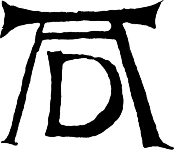
Monogram of Albrecht Dürer
It all adds up. The contemporary world has become involved in the past, in the roots of meaning that continue to move in our understanding of reality through signs, symbols, and logos, because – as neuroscience states – the image, the icon, and the imago mentis are the primordial link between man and his time, his history, and his identity. What man seeks in an image is a secure hold, a device that expresses his own ideas or exemplifies others’.
The symbol is the essence of creation and, as such, is the synthesis of an idea which can always be defended if intellectually unique and significant.
Testo/ text di/ by Azzurra Immediato, Foto/ photo di/ by Fabio Ricciardiello
[1] Translation of excerpt from Treccani monolingual Italian dictionary, 1° edition, 1986, published by Istituto dell’Enciclopedia Italiana
[2] ibidem
[3] Marshall McLuhan, Gli strumenti del comunicare, Italian edition 1967, Il Saggiatore – Understanding Media: The Extensions of Man, 1964, Ed. USA, McGraw-Hill Education